Little Village Mexican Food Truck: Case Study
Background
The Little Village Mexican food truck is a Chicago-based Mexican fusion restaurant on wheels. Their target customer is looking for out-of-the-ordinary Mexican meal with a modern twist. The food truck makes weekly downtown visits during lunch hours and in the evening after work. The Little Village Mexican Food Truck takes high-quality fresh ingredients and inspiration from a variety spices and tastes from around the world to create your new favorite tacos, tortas, and tamales.
The Goal
My goal was to create an app that makes it simple for The Little Village Mexican Food Truck’s customers to order and customize multiple meals in advance. I also wanted to include a way to pick-up meals easily without having to wait in line in my design. Finally, I wanted to include features that gave non-native English speakers the ability to view and use the app.
My Role
My role in this project as a UX designer was to take ownership of the app’s design, from concept to research to delivery. My responsibilities included user research iteration, wireframing, prototyping, usability testing, and the creation of a final high-fidelity prototype.
Project Duration
8 weeks
Design Process
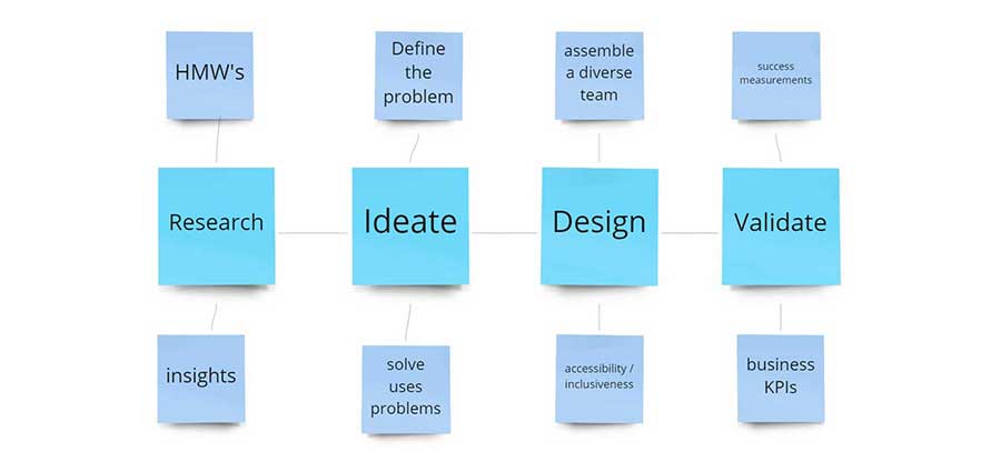
Research
I conducted interviews with five target users to gain a better understanding of user challenges and motivations. I distilled what I learned into actionable steps. My interview goals were:
- I want to understand common challenges users faces when making food vendor choices, especially regarding food trucks
- I want to identify frustrations people experience with the process of ordering from food venues online or in an app
- I want to learn how users feel about ordering in an app and what are their motivations
- I want to create a list of actionable objectives to help users with their main problem
Personas
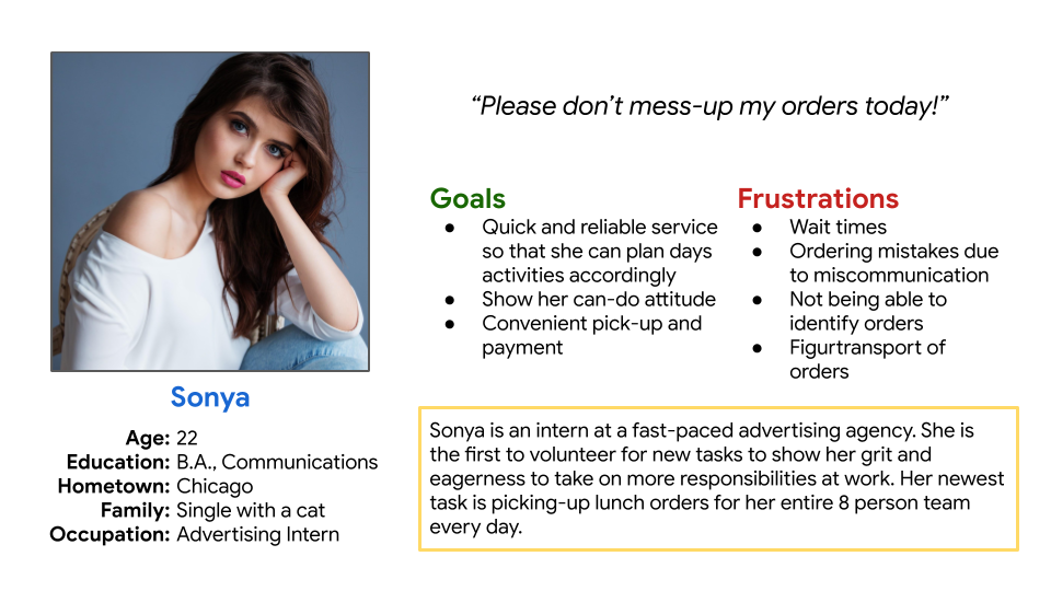
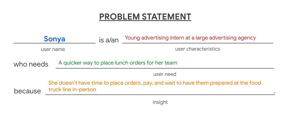
Sonya is 22-year-old recent college graduate who has just started her new job in the Loop. She is ambitious and wants to make a big impression with her work colleagues. Her schedule is filled with important tasks with pressing deadlines and require she keep a tight rein on her time to get it all done.
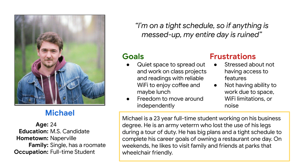
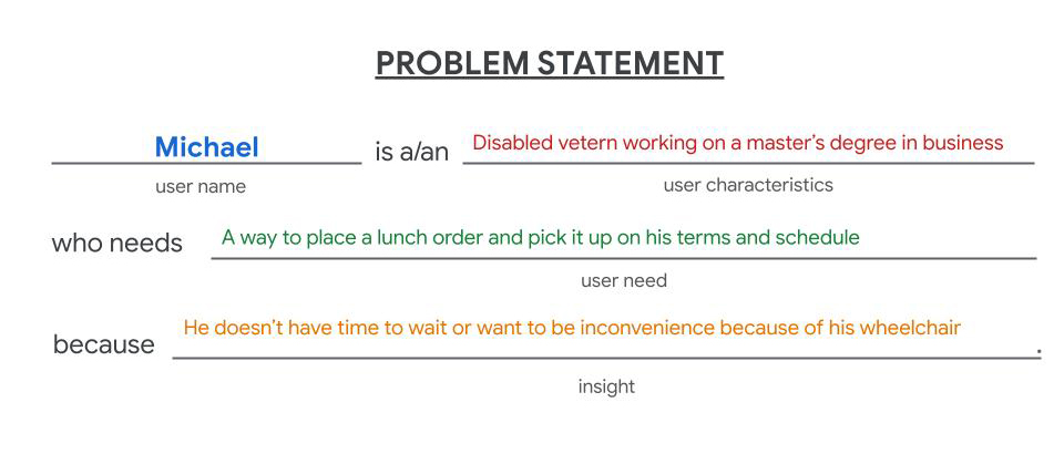
Michael is a disabled Army veteran working on his master’s degree in business. Michael is frustrated by the inconvenience of having to adjust his tasks and priorities because of his wheelchair. He likes his routine to work like clockwork, and any disruption in his schedule will ruin the rest of his day’s activities.
Problem Statement
The Little Village Mexican Food Truck’s target customer wants to order multiple meals for themselves and others, but don’t have the time to wait in line during busy peak times.
The most important pain points I uncovered were:
- The app flow of screens is important. It needs to display the food truck location first before any consideration for ordering
- Most users want the option to customize their selected food item
- Users want to view their cart and the ability to modify it before checkout begins
- Non-native English speakers want to speak directly with a live person, view the app in Spanish, or have a UI that isn't dependent on having any fluency in English
- Users want clear and simple instructions about pick-up, including accessing this information after they have completed an order and closed the app
Designs
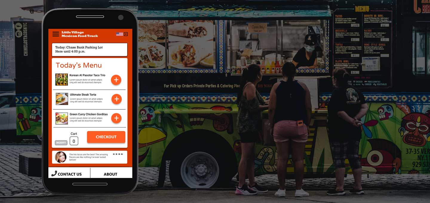
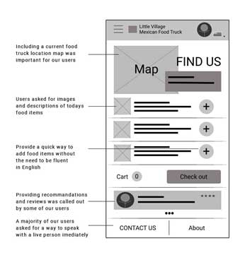
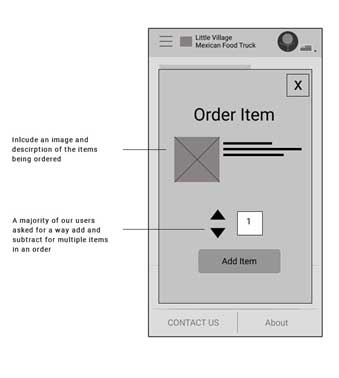
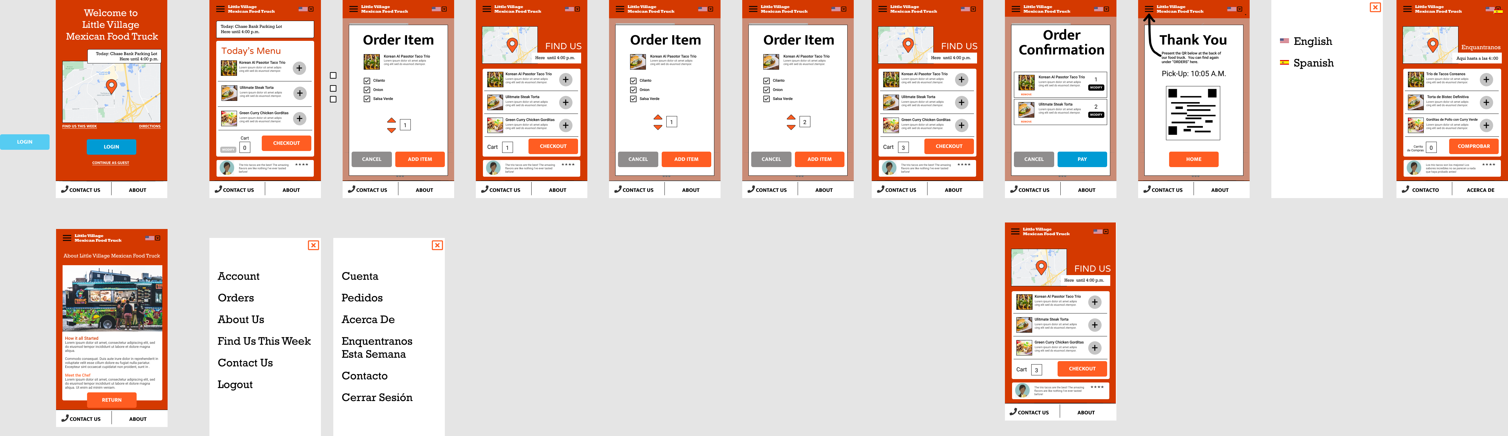
I attempted to address user's request to see the current food truck location and for how long it will be there on the home page. I also included food item images with descriptions and a way to add items to your order without the necessity of being a fluent English speaker. Users indicated reviews and recommendations as important to them. I also included this. On the order page, I provided the item image and description, along with the ability to add and subtract multiple items to an order.
Usability Study
Study type: Moderated usability study
Location: United States, remote and each participant went through the usability study in their own home.
Participants: Five participants, each completing the study individually
Length: Each session was 20-30 minutes, based on a list of prompts where I asked participants to completed 5 tasks to help me answer these questions:
- Are users able to add multiple food items to their order?
- Are users able to use the app if they are not native English speakers?
- Are users able to pay for their meals in the app?
- What can we learn from the steps the users take to order, pay, and get pick-up instructions in the app?
- Are there any parts where the user is getting stuck?
Low-Fidelity Wireframe Prototype Usability Test
View my prototype: The Little Village Mexican Food Truck app
I tested my first low-fidelity design prototype with these features:
- Location of food truck
- Image and description of food items
- Add/subtract multiple items to order
- Payment
- Confirmation page with instructions for pick-up
- Ability to use app without being a native English speaker
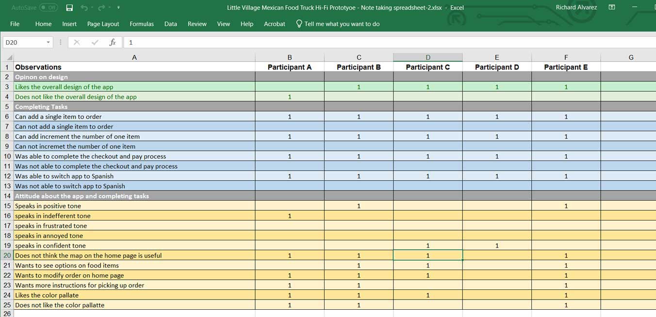
Findings
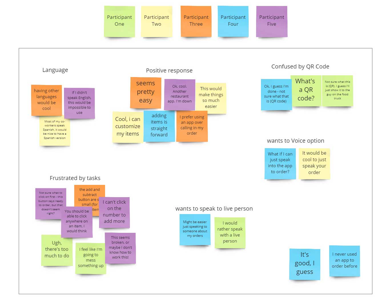
The following themes surfaced from my first moderated usability test:
- Based on the theme that for most users, it’s not immediately clear how to begin, an insight is users need a direct starting point for creating orders.
- Based on the theme that for most users, the buttons for adding and subtracting items to an order were too small, an insight is most users want larger buttons to add and subtract items for orders.
- Based on the theme that most users want a Spanish translation, an insight is the app should provide other language options.
- Based on the theme that most users did not feel confidant completing an order, an insight is users need more clear direction on the steps to take to complete an order.
- Based on the theme that most users felt confident about pick-up instructions, an insight is users understand the pickup instructions and are comfortable with the next steps.
Results
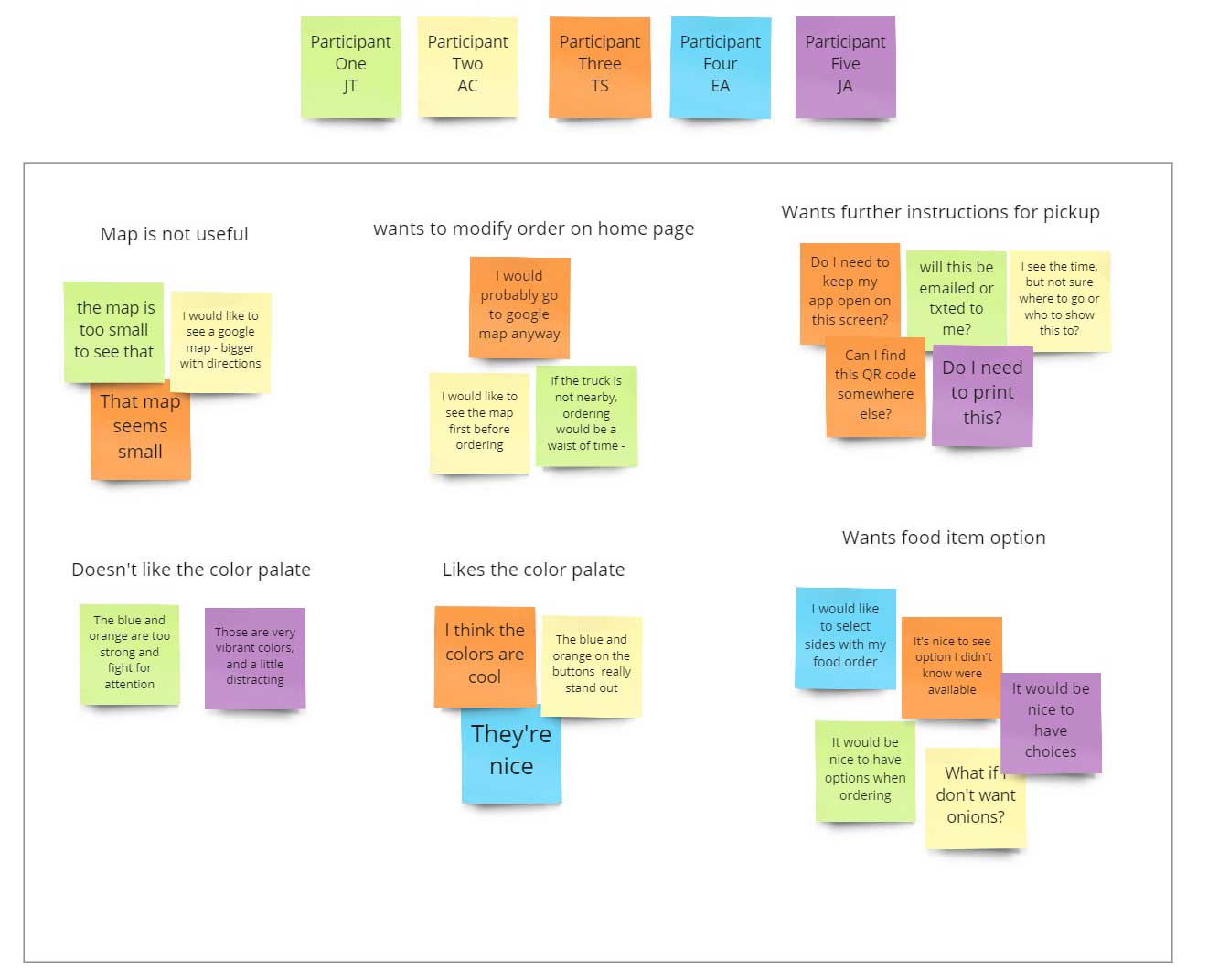
Users felt the home page packed too much information. Also, that, combined with our background color combination, there were too many items fighting for attention.
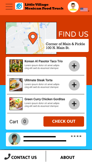
Although the map provided some use, most participants concluded that if the food truck wasn’t in their nearby vicinity, there was no sense in proceeding with a food order. I concluded that the map on the home page was too small to be useful.
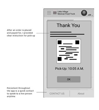
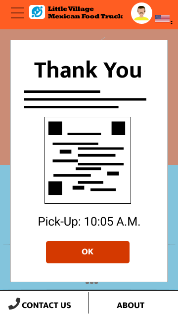
Most users also wanted some customization on the individual food items. Once in order was purchased and payment completed, users were unsure about the pickup instructions. Users wanted to know how to proceed after they have closed the confirmation window or the app.
Low-Fidelity Affinity Diagram
High-Fidelity Mockup
2nd moderated usability test observation table
2nd moderated usability test affinity diagram
High-Fidelity Mockups, Before and After
Before
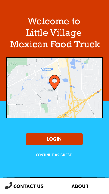
After
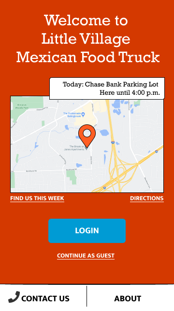
Users indicated that the vibrant colored background was competing for attention on screens. I simplified the background color and added more information to the location map. It now includes a current location label, links to weekly locations, and directions.
Before
After
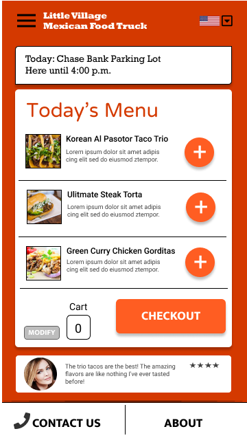
The updated menu page has a cleaner header and menu layout. I have also added an option to modify your orders so that users can update before they checkout.
Before
After
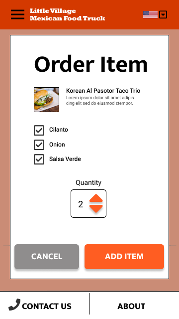
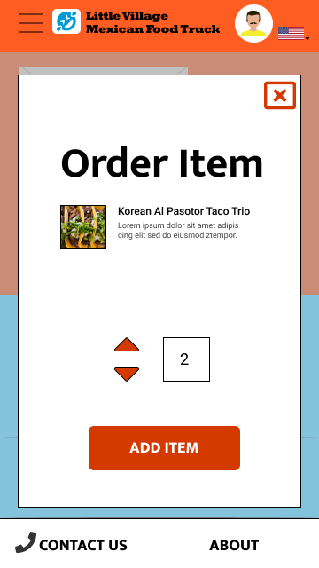
From my research, users wanted options for each food item. I have added this and standardized UI elements across the app.
Before
After
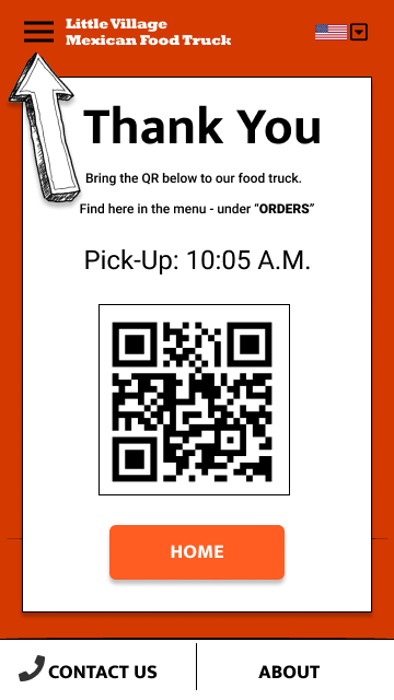
My updated order confirmation page includes clear and detailed directions for food pickup. This includes how to find the QR code again, after users leave the confirmation page or the app.
High-Fidelity Mock Prototype Usability Test
View my high-fidelity mockup prototype: The Little Village Mexican Food Truck app
Accessibility Considerations
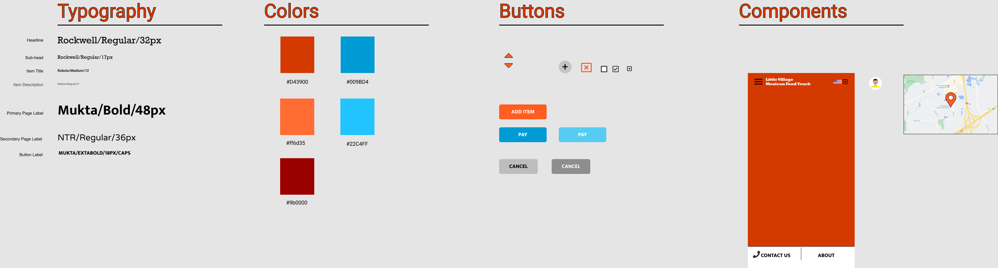
For the Little Village Mexican food truck, I have used alt tags on images for all screen readers to read the content. I have also used the WebAIM (https://webaim.org/resources/contrastchecker/) website to ensure that my text and background color combinations are WCAG AA compliant. With consideration for non-native English speakers, I have used icons and images where possible so that ordering food items does not require reading to complete such tasks.
Future Next Steps
I have included an option to translate the app into Spanish. Further research and testing will be required to determine if this is a viable technological feature that can be added. Along with this research, I have included alternative methods for non-native English speakers to use the Little Village Mexican Food Truck app, including the use of icons and images and a persistent “Contact Us” CTA. Future research can determine if these alternate methods alone can suffice for ease of use and a good experience for a non-English speaking population.
Final Thoughts
In my research and design of the Little Village Mexican food truck, I learned that the first ideas for the app are only the start of the design process. Usability test and peer feedback have greatly influenced each iteration of the app I have designed. I know that after my final designs are delivered to my developer colleagues, my post-launch research can begin. As users continue to give feedback, there is the opportunity to discover new findings for future enhancements. I’m thankful to my colleagues who contributed to the design of this app for their support and collaboration. I am also grateful to all the participants I interviewed. The honest feedback they shared with me were the keys to all improvements made.