Forever Friends Dog Shelter: Case Study
Background
Forever Friends prides itself on bonding humans and dog together for life – with no regrets. That's why they're dedicated to matching the perfect dog parents and dogs. They care for the wellbeing of each dog they shelter. They know that each breed and individual dog is unique. Each comes with their own story and care needs for health and happiness.
The Goal
My goal was to create a website that makes it simple for Forever Friends Dog Shelter users to learn about the adoption process and make well informed decisions in preparation for adoption. In addition, I want to give users the ability to start the adoption process online.
My Role
My role in this project as a UX designer was to take ownership of the website design, from concept to research to delivery hand-off. My responsibilities included user research, wireframing, usability testing, iteration, and the creation of prototypes.
Target User
The Forever Friends Dog Shelter user is well informed and serious about the responsibility of bringing a Forever Friends dog into their life.
Project Duration
6 weeks
Design Process
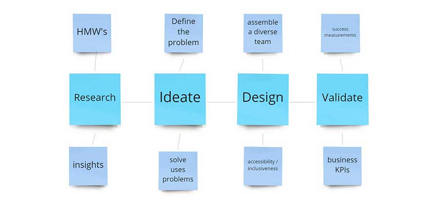
Research
I created a responsive website for the Forever Friends Animal Shelter to help customers learn about adopting rescue dogs and begin the application process. Before launching, I wanted to identify how best to provide a design and content where potential forever human parents can learn about the steps in the adoption process and a way to begin this process.
Study type: Moderated usability study
Location: United States, remote (each participant went through the usability study in their own home)
Participants: Five participants, each completing the study individually
Length: 20-30-minute sessions, based on prompt. I asked participants to complete five tasks
to help answer:
- Do users understand the steps involved in adopting a dog from Forever Friends?
- Are users able to begin the adoption process?
- Can users understand how to come back and check the status of their adoption process?
- Can users easily find information about volunteering and making donations from anywhere on the site?
Personas
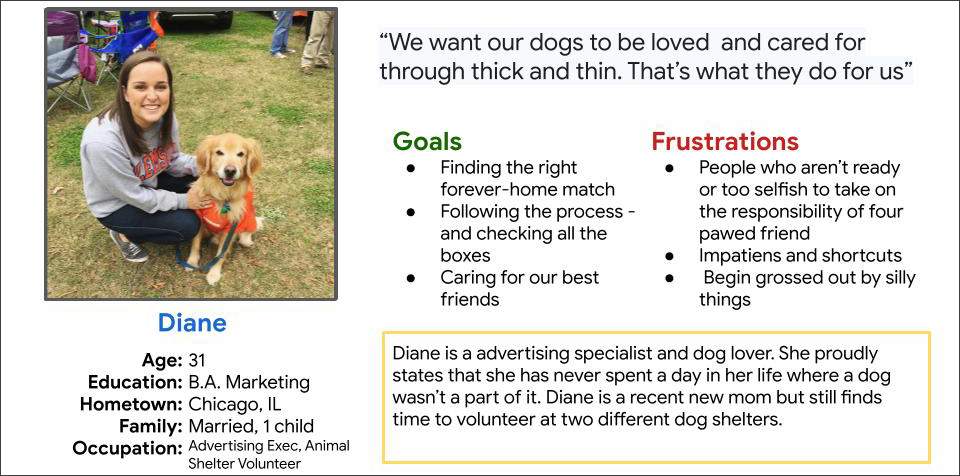
Diana is 31-year-old marketing professional, dog lover, and volunteer at a local animal shelter She cares deeply about the care and wellbeing of the animals at the shelter. Because of this, she takes finding the right home very seriously.
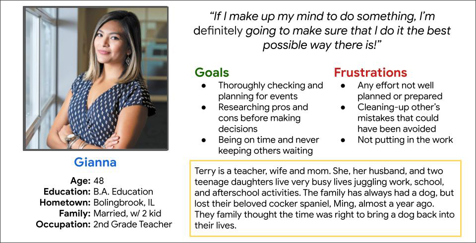
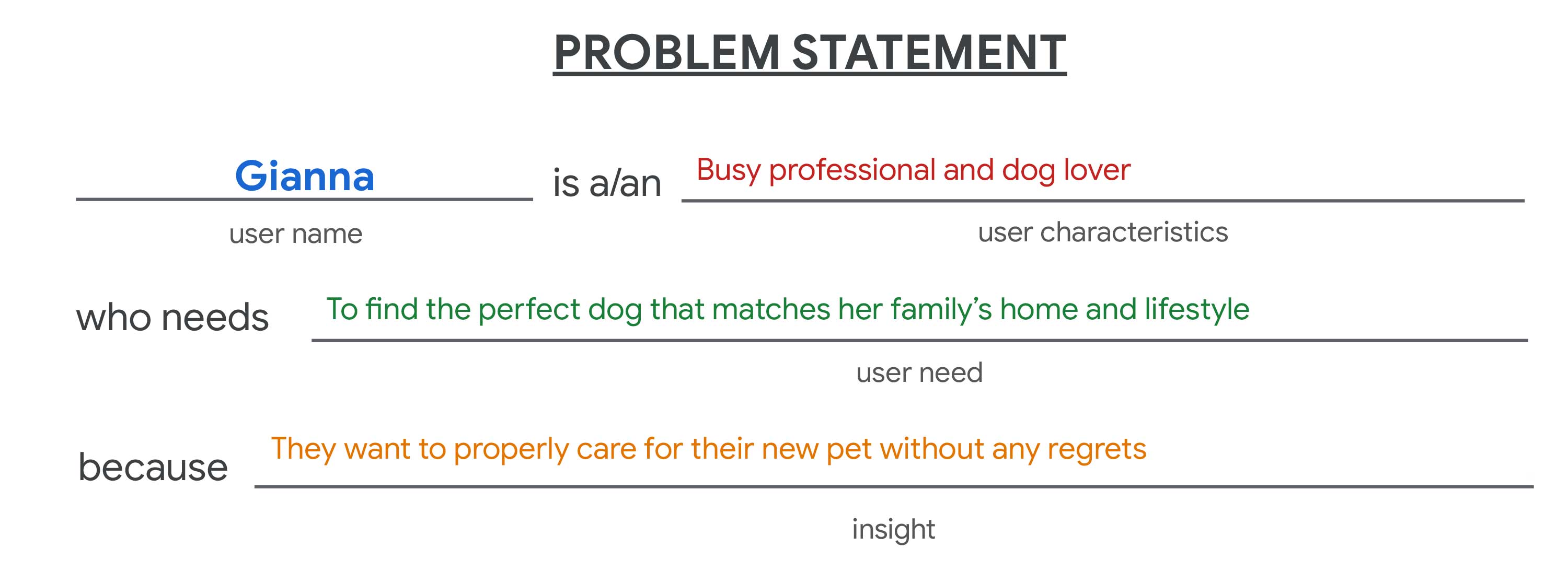
Gianna is 2nd grade teacher and mom. When Gianna takes on a task, she sees it through all the way to the end, making sure that each step is completed on time and in the best way possible. Her girls have been pleading for a dog for some time, and now Gianna and her husband think the family is ready to take on this responsibility too.
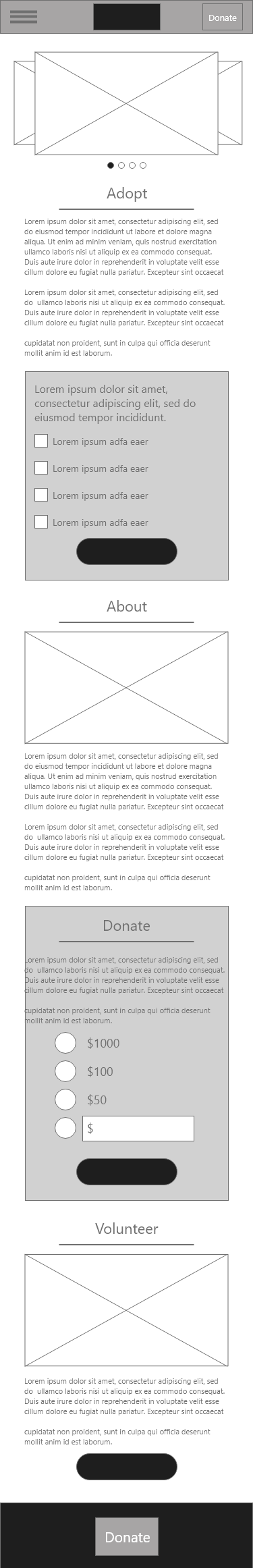
Low-Fidelity Wireframes
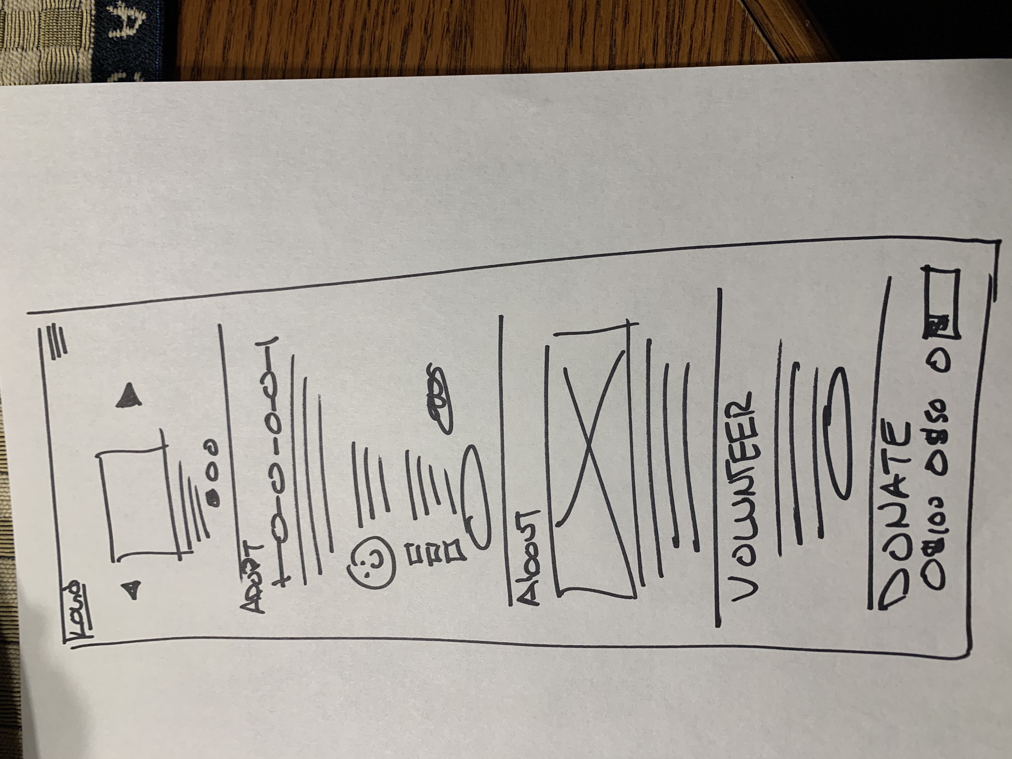
Here are my initial home page sketches for the desktop and mobile. In these, I attempt to capture the needs from my initial user interviews.
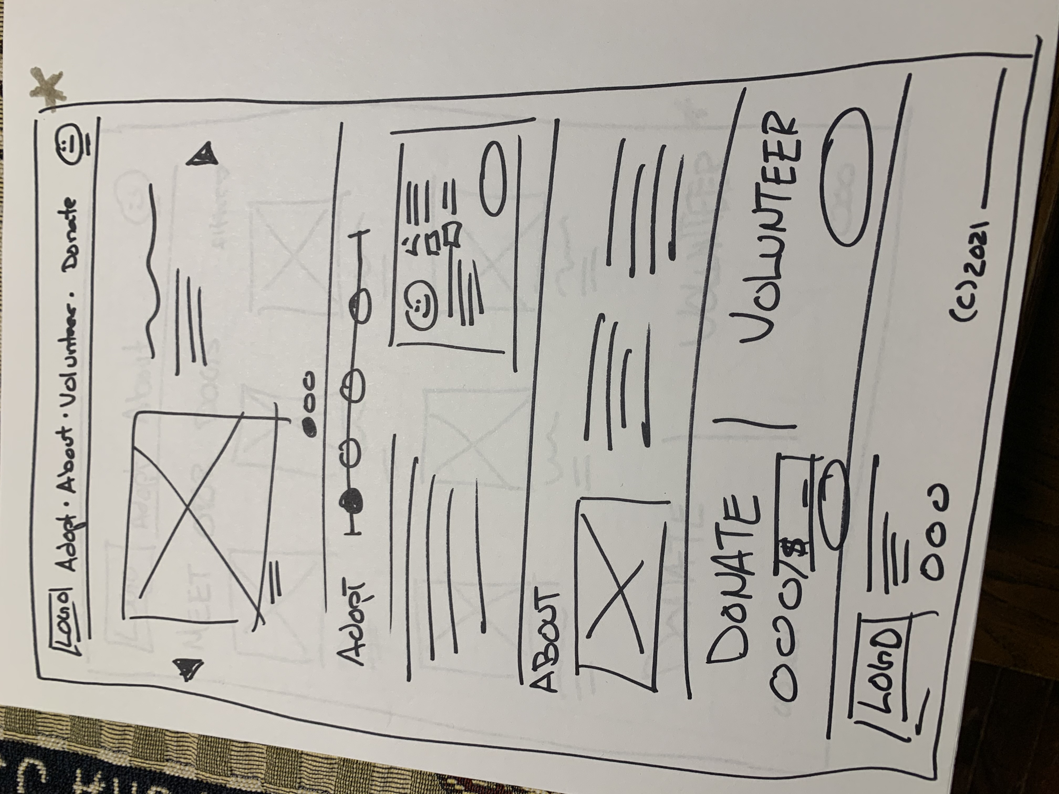
Here are my early low-fidelity wireframes that propose early solutions to my user’s problems.
On the home page, I address the users request to see dogs and learn about the steps in the adoption process. I also included information areas to learn about the Forever Friends Shelter, volunteering and donations.
Problem Statement
By applying the user pain points I identified, here is the problem statements for our persona:
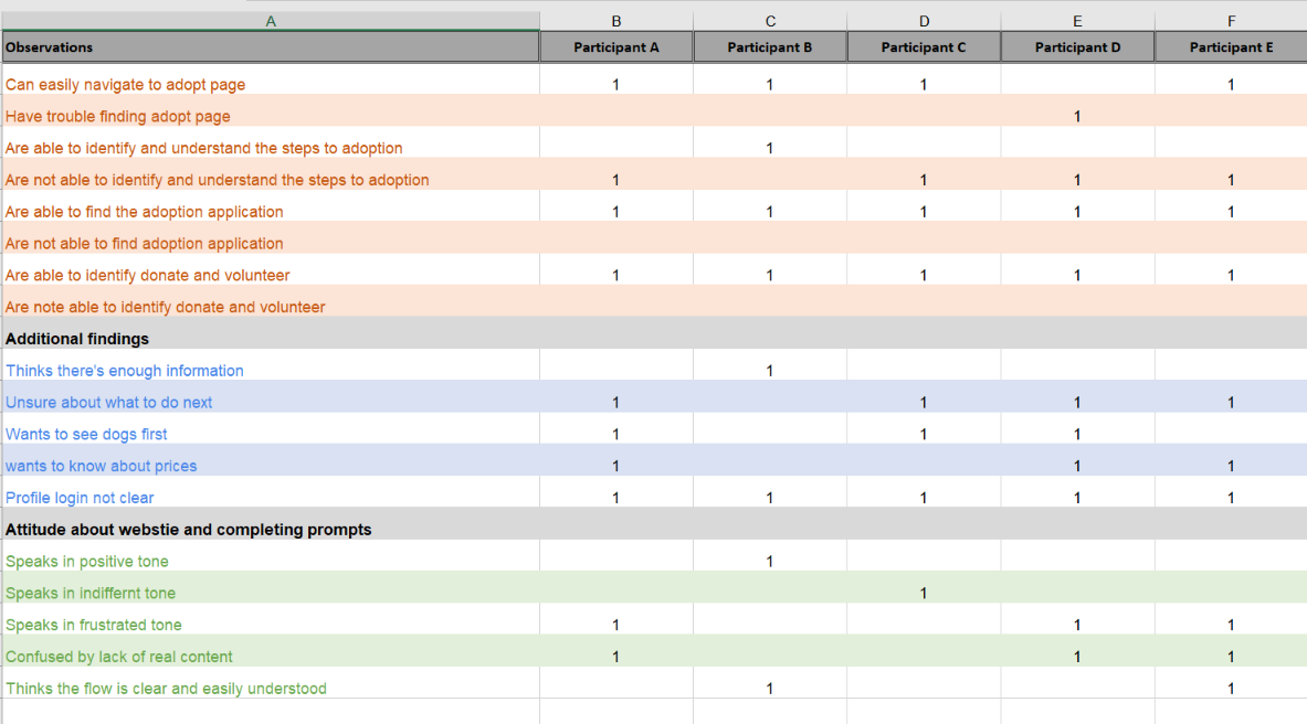
Moderated Usability Study Observations
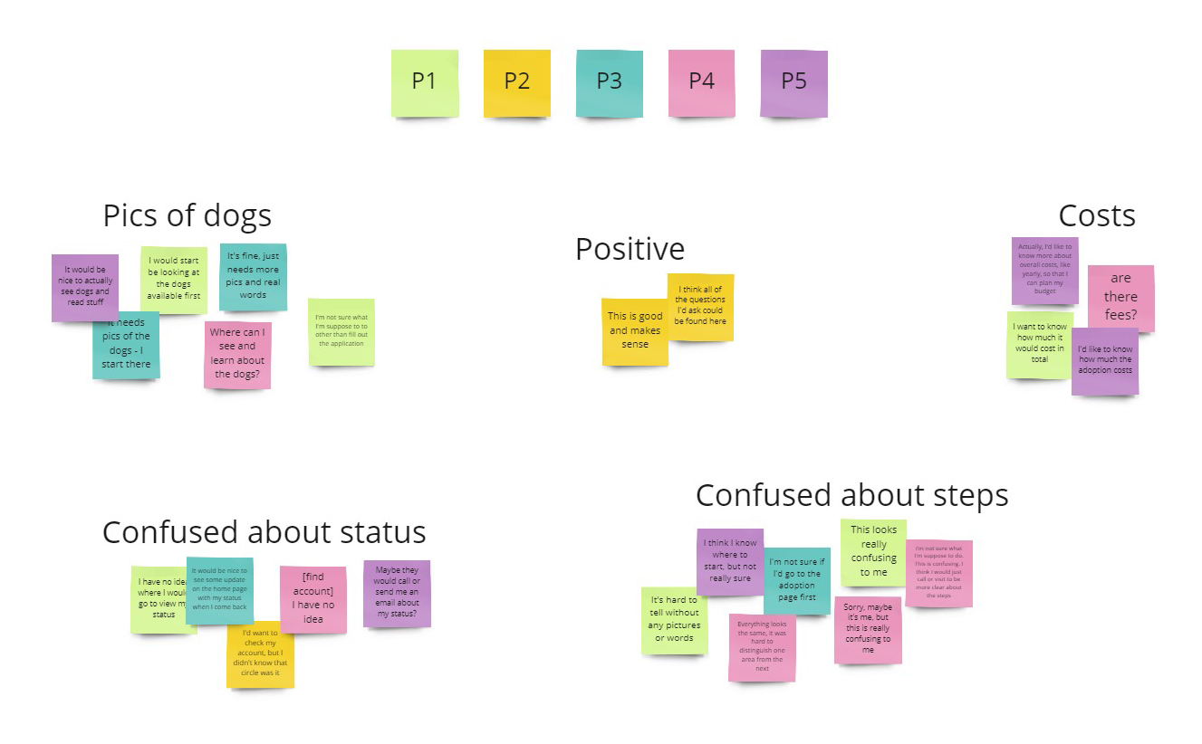
Low-Fidelity Affinity Diagram
Findings
I used the insights I discovered to identify pain points my users were experiencing. I entered the research with a set of assumptions, but those assumptions changed as I spoke to real people who deal with the topic I was researching. The following themes surfaced from my first moderated usability test:
- Users want to begin the adoption process by seeing and learning about the dogs available first
- Users want to know about adoption costs
- Users want to understand the overall costs in terms of a yearly budget with their forever friend after adoption
- Users wanted updates on the status of their application after is has been submitted
Results
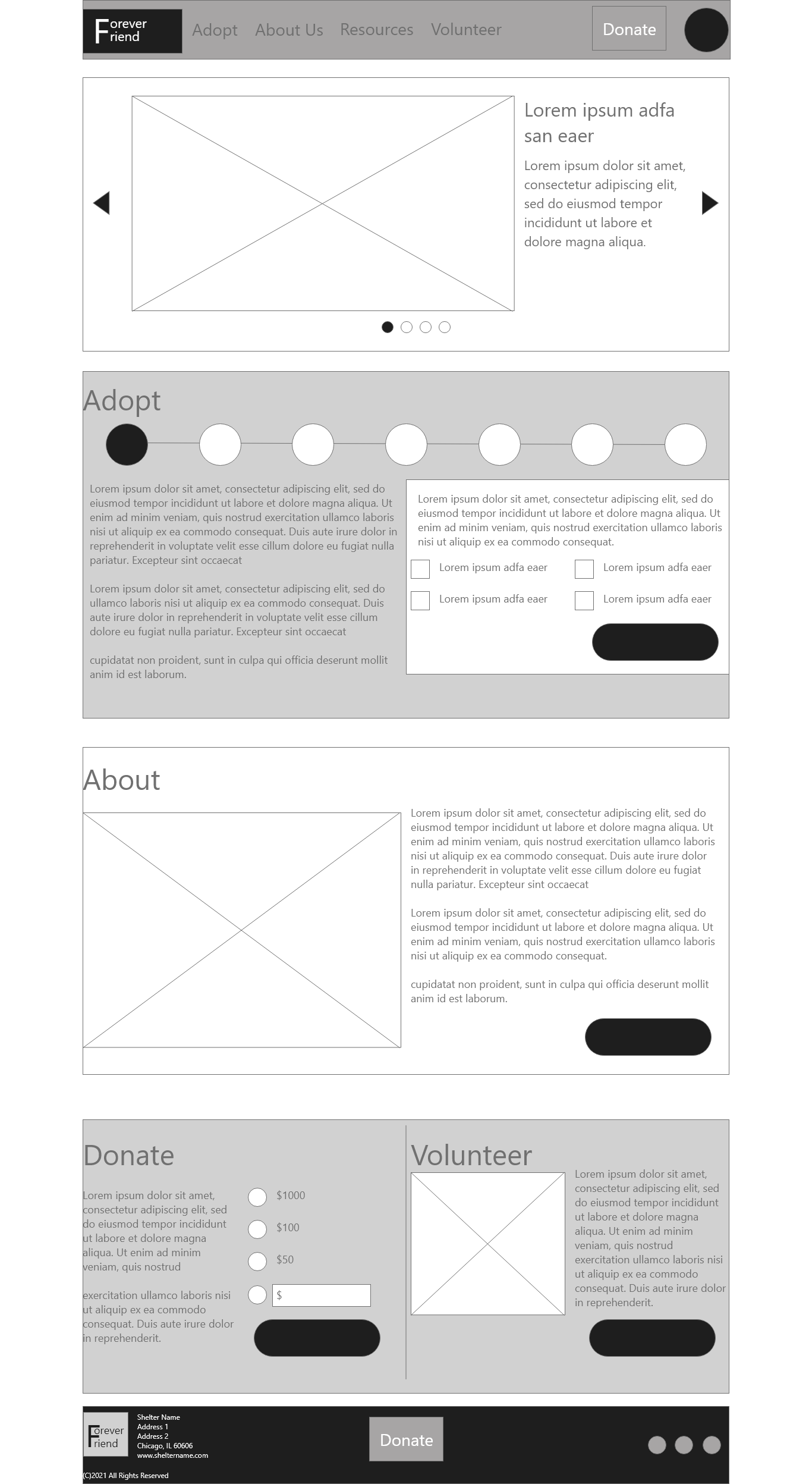
Users felt that the low-fidelity wire frames didn’t provide enough information about the content provided on the site. Most users wanted to begin their own process for adoption by looking at the dogs currently in the shelter. Based on this finding, I have added a gallery of dogs in a prominent position on the home page.
Users also asked for more information about costs for adoption and overall costs for the wellbeing and care of dogs for their own yearly budgets. Based on this insight, I added budget calculators and a view of all adoption costs.
Finally, users were frustrated with the lack of follow-up directions and visibility for obtaining adoption status updates once they have begun the process. This insight requires that I provide clear profile account access in the header.
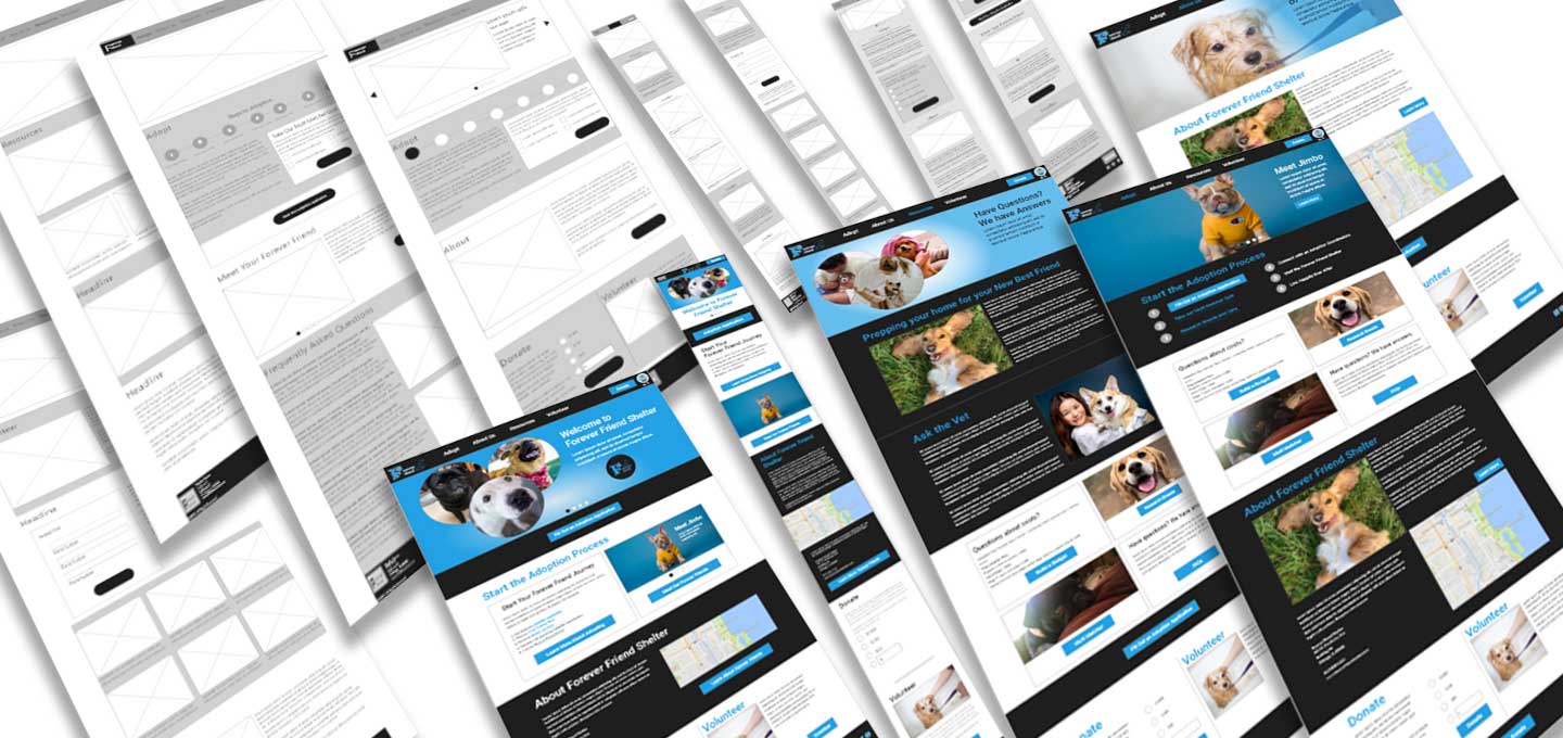
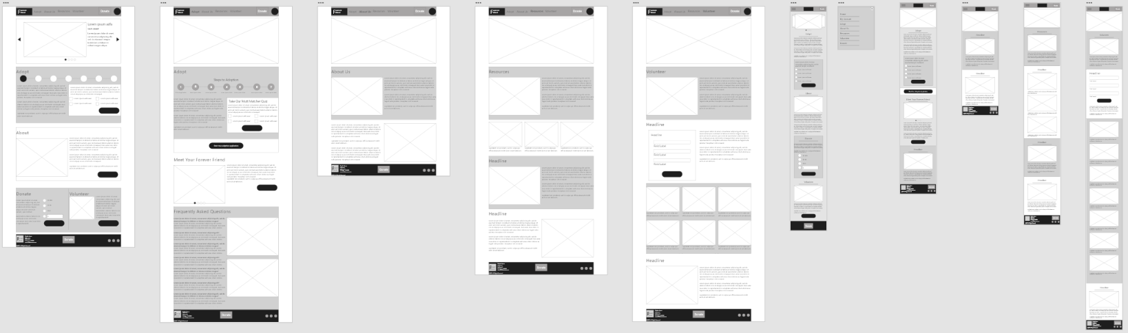
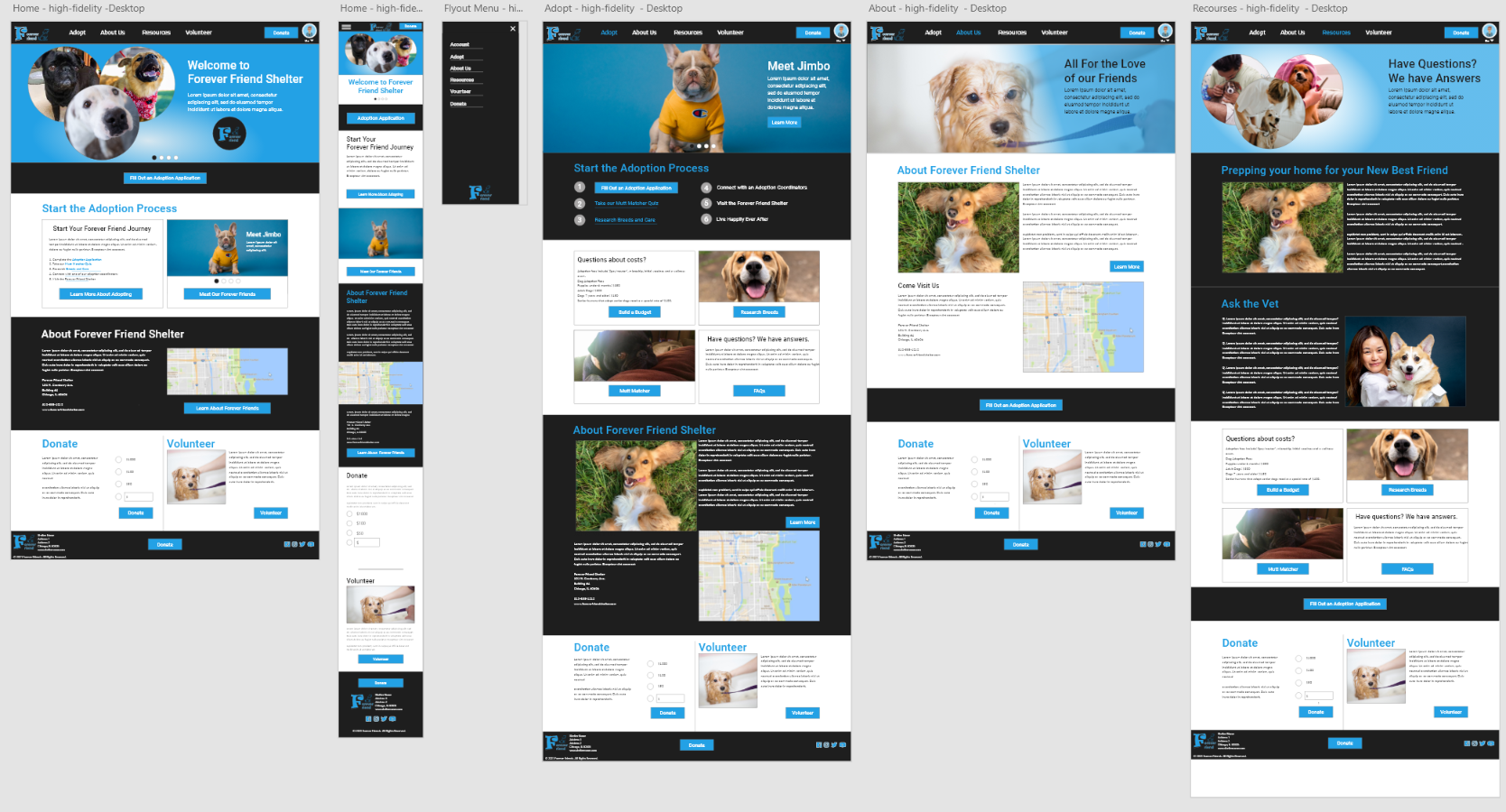
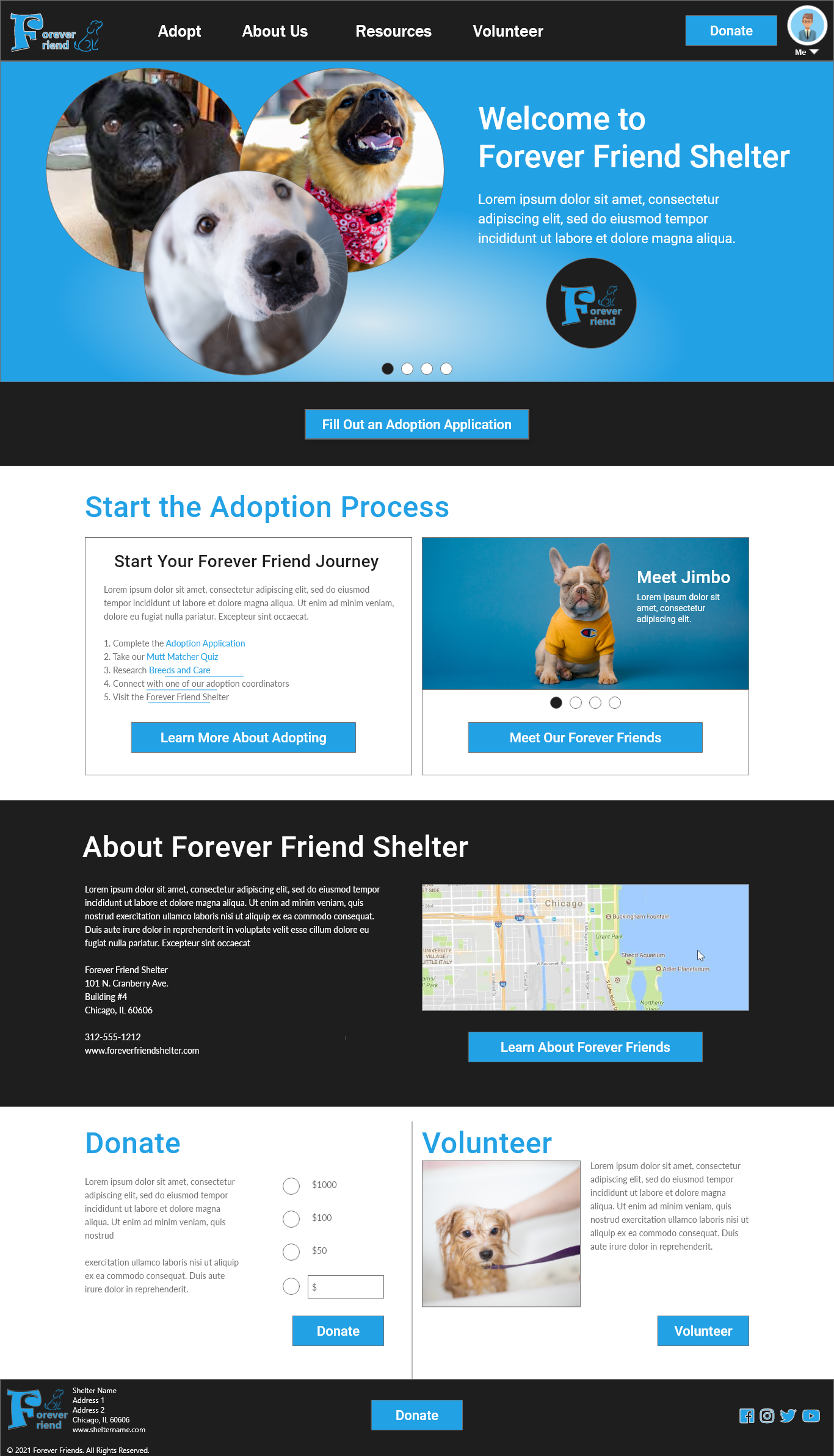
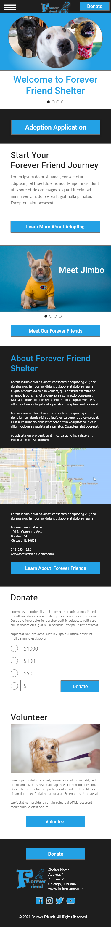
High-Fidelity Mockup
High-Fidelity Mock Prototype Usability Test
View my mock prototype: The Forever Friend Dog Shelter Responsive Website
Accessibility Considerations
I used alt tags on images for allow screen readers to read the content on the Forever Friends Shelter responsive website. I have also used the WebAIM to ensure all text and background colors are WCAG compliant.
Future Next Steps
Further research and testing will be required to determine if additional answers, tools, and content can be added to the site to provide the necessary adoption information users want. I have also included an account profile method that will allow users to follow-up during and after the adoption process. Additional research should be conducted to verify the usefulness of these content areas and services.
Final Thoughts
In my research and design of the Forever Friends Shelter responsive website, I learned that my first ideas for the website are only the start of the design process. Usability tests and peer feedback have greatly influenced each iteration of the website I have designed. I know that after my final designs are delivered to my developer colleagues, my post-launch research can begin. As users continue to give feedback, there is the opportunity to discover new findings for future enhancements. I’m thankful to my colleagues who contributed to the design of this website, for their support and collaboration. I am also grateful to all the participants I interviewed. The honest feedback they shared with me were the keys to all improvements made.